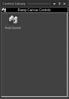
The Control Library provides a convenient location for storing customized or often-used controls. To add a control, select it in the Surface and Alt+drag or copy/paste it into the Control Library. An icon for the control appears under the selected category (default: Biamp Canvas Controls). The icon can be re-named by selecting it, then clicking on the text. New category files (.apl) may be created by right-clicking over the Control Library.
When a category is selected, the available components appear under the category heading. A vertical scroll bar will appear if all available components in a category cannot be displayed on a single page. To place a control from the library, drag the icon into the Surface. When Control Library changes are made, the affected category files (.apl) are saved automatically (under Shared Documents).
A Menu icon (upper-right of title-bar) allows the Control Library to be floating or docked, or to be hidden (closed) or to use Auto Hide (if docked). The menu may also be accessed by right-clicking over the top bar of the Control Library. The thumb-tack allows the Control Library to remain open (disables Auto Hide). To close the Control Library, click on the "X" in the upper right corner. The Control Library may again be opened by selecting a category from the Control Library Menu. It can also be accessed by clicking the View Menu and choosing Toolbars. It is not accessible during live control or test sessions.